Guide
AI dashboards: How to get real-time insights without the sprawl
Legacy dashboards had a good run. When they first showed up in the late 90s, they gave business users an easier way to visualize and explore their data on their own. That was a huge deal back then.
But somewhere along the way, every team ended up with forty dashboards across different tools. Since you've lived through that kind of sprawl, you know how much time it costs. By the time you've pulled the right dashboard, cross-checked the numbers, and built the view you actually needed, the window to act on it has already moved.
AI dashboards are supposed to fix that. The promise: Fewer dashboards, faster answers, and less chaos. Here's where these promises actually hold up.
What's different about an AI dashboard?
An AI dashboard is a BI interface that lets you ask questions in plain English and get answers from live data. It uses natural language processing to interpret the question, machine learning to surface relevant patterns, and real-time data pipelines to make sure you always know what’s happening inside your business.
Instead of waiting on a pre-built report, AI can identify relevant insights, generate summaries, recommend visualization types, and optimize your dashboard layout for maximum impact. You can even follow up with "How does this compare to last quarter?" and get relevant summaries without starting over.
This is where sprawl starts to reverse. Teams don't need twenty static dashboards when the interface itself adapts to whatever question comes up next.
Anatomy of an AI dashboard: How different pieces fit together
Before we get into use cases, it's worth understanding what's actually working under the hood. AI dashboards rely on three core technologies, and each one solves a different part of the problem.
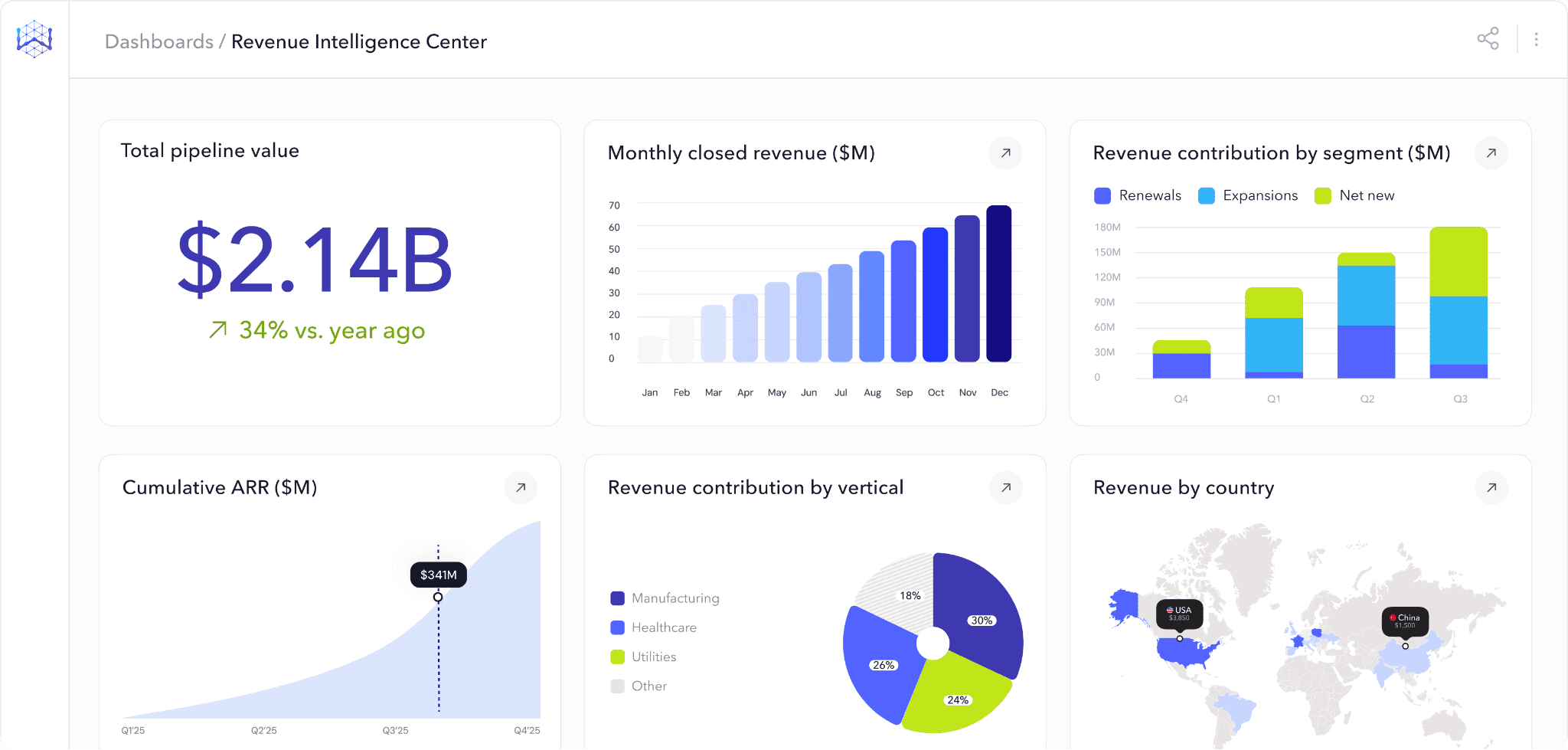
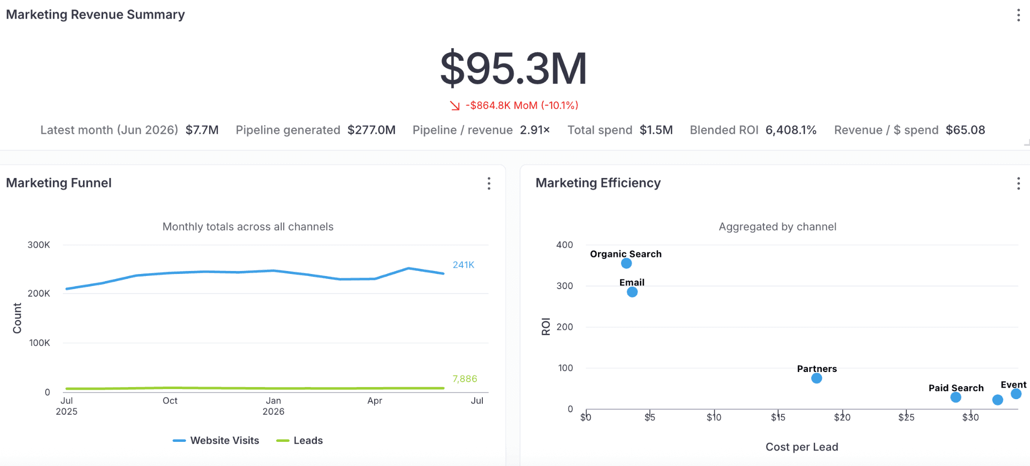
Data visualizations and KPIs
Visualizations in an AI dashboard aren't static charts. You can narrow any view by time period, region, or any dimension in your data model without building a new report. Filters apply in real time, and you can layer them to isolate the exact slice you need.
KPIs work the same way. Pin the metrics that matter most to your team, like revenue, churn, or pipeline coverage, and they stay live at the top of the dashboard, refreshing as the underlying data does. You finish the analysis in the same place you started it, instead of bouncing between five reports to answer one question.

Natural language processing (NLP)
NLP is what makes self-serve analytics possible. This layer parses a question like "Which regions are underperforming this quarter?", identifies the intent behind it, and maps it to the right tables, fields, and relationships in your data model. From there, it generates a database query, runs it, and returns the answer as a visualization or summary. The more well-defined your data model and metric definitions are, the more accurate the output.
Machine learning
The ML layer makes the dashboard proactive. Every view opens with an AI-generated summary that tells you what changed, which metrics are driving the movement, and why it's worth your attention. You don't have to scan tiles, run the comparisons in your head, or remember what last week's number was—the read is waiting for you at the top of the dashboard. You find out things are off track while there's still time to do something about it.
AI dashboards vs legacy BI dashboards
Legacy BI dashboards create more work than they save. Someone has to build them, maintain them, and update them every time someone asks a new question. AI dashboards were built to eliminate that cycle. Here's how the difference shows up:
Feature | AI Dashboard | Legacy BI dashboard |
Data access | Anyone can ask questions in plain English. No SQL required for routine queries. | Primarily built for analysts and power users. Business users can view pre-built dashboards, but can't easily explore beyond them. |
Data freshness | Pulls from real-time or near-real-time data pipelines, depending on your infrastructure. | Scheduled refreshes, typically weekly or monthly. Some modern BI tools support near-real-time; however, the default remains batched. |
Pattern detection | ML surfaces anomalies, trends, and correlations automatically. Useful for catching things you wouldn't think to look for. | Manual. If someone didn't build a view for it, you have to file a ticket and wait in the analyst queue. |
Collaborative analysis | Share a finding as a live view, not a screenshot. Your team sees the same data, asks their own follow-ups, and picks up where you left off. | You export a PDF or take a screenshot. By the time your team sees it, the data's already stale. |
Customization | Views adapt dynamically based on the question. New charts can be created on the fly. | Dashboards are pre-built. Changes require analyst involvement and backlog prioritization. |
How different teams use AI dashboards
1. Consolidated reporting for sales
If your sales team feels like they spend more time chasing data than closing deals, they probably do. Research says reps spend 60% of their time on non-selling tasks. A major chunk of that goes into pulling reports, reconciling numbers across tools, and waiting on the data team.
AI dashboards consolidate CRM, marketing platforms, and product analytics into a single live view. Reps can see which campaigns are driving pipeline, track how accounts are progressing, and catch early signals when a deal starts to churn. No toggling between tools or manually reconciling numbers.
Descope was losing hours every week to exactly this kind of manual assembly. By the time sales and marketing had the numbers they needed, the window to act had closed. After adopting WisdomAI, they cut report generation time by 90% and reached insights 5x faster.
2. Real-time revenue monitoring for finance teams
Revenue leaks rarely look problematic. A renewal due date passed because nobody was tracking the account. A discount creeps above the target without triggering a flag. None of these feels urgent on its own, but they compound quietly and show up three months later in a quarterly report as a number nobody can explain.
AI dashboards keep these signals visible as they happen. Renewal timelines, discount patterns, and expansion indicators all live in one continuously updating view. When an account churns, you get notified immediately. Your team sees the problem while it's still small enough to fix.

3. Self-serve analytics for GTM
In most organizations, every data question from marketing, sales, product, and RevOps ends up in the same place: the analyst backlog. Each request takes fifteen minutes to build, but when there are thirty of them a week, the data team has no time left for the deeper analytical work.
AI dashboards make these questions self-serve. Any GTM team member can pull their own answers and build their own views without filing a ticket or waiting in the queue.
Take Rubrik. Their data team had 5x more dashboard requests than they could handle, most of them from GTM. WisdomAI made those questions self-serve. The backlog shrank and teams could now focus their time on moving the business forward.
How to get the most out of your AI dashboard
Stop facilitating old habits
Teams often deploy an AI dashboard and then use it exactly like their old BI tool, asking for pre-built static views for every use case. That defeats the purpose. The value of an AI dashboard is that anyone can ask questions directly and get answers without a pre-built report. If your team is still requesting custom views for every new question, they're not using the tool the way it was designed to work.
The fix: Start by identifying the five or ten questions your team asks most often and train them to ask those directly through the dashboard. Once that habit sticks, the pre-built views become unnecessary.
Build it around your business
AI dashboards don't need pre-built views, but they do need a well-defined data foundation. That means connecting the right data sources, aligning metric definitions across teams, and making sure the semantic model reflects how your business actually talks about its data. If your team asks, "Which accounts are at risk this quarter?" and the dashboard can't answer it, you’re likely missing important source data or adequate AI context to connect tables, schemas, and semantic definitions.
The fix: Sit down with each team and list the questions they ask every week. Then make sure your data sources, metrics, and definitions are set up to support those questions.
Watch out for AI reasoning
Most AI dashboards give you an answer but don't show how it got there. Which data sources were queried? How was the metric calculated? What filters were applied? Without that transparency, your team is left guessing whether the answer is reliable, and most people won't act on a number they can't verify. That's how you end up right back where you started — manually pulling data to double-check what the dashboard already told you.
The fix: Look for big data analytics tools that surface their logic at every step. You should be able to trace any insight back to its source data, see the calculation behind it, and understand why the dashboard chose that particular view.
Embed it into the workflows your team already uses
An AI dashboard that lives in its own tab gets checked once a day. The teams that get the most value surface insights directly inside the tools they already use—Slack, email, CRM. A renewal risk shouldn't sit in a dashboard waiting to be found. It should show up where your CS team will actually see it.
The fix: Look for platforms that support embedded analytics. Embedded Analytics lets you surface dashboards, insights, and query interfaces directly inside the tools your team already works in.
AI dashboards are fast. But fast isn't enough.
So far, we've covered what AI dashboards promise and how they deliver on most of it. They solved dashboard sprawl, made reporting faster, and gave every team direct access to data. That's a real upgrade over legacy BI.
But speed doesn't solve complexity. Ask an AI dashboard, "What's our revenue this quarter?" and you'll get a clean answer in seconds. Now, ask "Why are enterprise renewals slipping in EMEA?" and it stalls. That’s because that answer lives across your CRM, call transcripts, support tickets, and contract terms — not in a single table.
AI dashboards work well when the question is specific, the data is structured, and the answer lives in one system. Most real business questions aren't that clean. They span multiple systems, involve unstructured data such as emails and call recordings, and need context that a dashboard was never designed to carry.
The answers come faster. But complexity is still the trade-off.
From dashboards to decisions: Agentic analytics
To move your team from faster dashboards to better decisions, you need more than a smarter interface. WisdomAI was built for the questions dashboards can't reach.
Take that EMEA renewals question. An Analytics Agent would pull renewal data from your CRM, scan recent call transcripts for churn signals, and cross-reference support ticket volume to surface the right answer. That's not a faster dashboard. That's a decision your team can actually act on.
And unlike most AI analytics tools that give you an answer without showing their work, every insight is traceable. The Adaptive Context Engine carries your metric definitions, business rules, and organizational context into every query, so the answers are always grounded in how your business actually works—and you can verify exactly how they got there.
The shift from dashboards to decisions starts here. Book a demo today.