Guide
9 Power BI alternatives worth considering in 2026
Building dashboards is (relatively) easy. Delivering decision-ready insights is hard.
Power BI gives you a thousand ways to visualize what has already happened — that's the job it was built for — but it doesn’t offer any shortcuts for data and business teams trying to parse out what they should do next. That functionality gap is quietly costing your team time and money.
To see which tools are helping teams close this data-to-decision gap, we tested 10 Power BI alternatives across four key criteria: AI, governance, usability, and scalability. Here's what we found:
Power BI's relevance isn't gone. It's narrowing.
Power BI is still a popular choice for analytics teams that need structured reporting and visualization, especially those already in the Microsoft stack. It pulls data from Azure, Excel and other sources, allowing data teams to create sharable visualizations, dashboards and reports. For recurring reporting needs on structured datasets, this setup works.
However, the business expectations from business intelligence (BI) is changing. Rarely do decision makers have time to flip through five dashboards to find out what changed and why. Business users need a natural-language answer for split-second decision making — without having to wait for a ticket.
The deliverable is no longer a dashboard. Users need real-time reliable answers. And that's where Power BI's relevance starts to narrow.
What Power BI does well
Data connectivity: Connects to a wide range of cloud and on-premises data sources for easy access and unified analysis.
Interactive dashboards: Lets users build and customize visual dashboards to track performance and share insights across teams.
Data modeling: Power Query and DAX do the heavy lifting, turning raw data into something meaningful.
Collaboration and sharing: Works well with Power BI Service, Teams, and other Microsoft 365 services.
AI-driven insights: Uses AI to detect trends, forecast outcomes, and highlight key data patterns automatically.
Where it starts to feel limiting
Limited support for unstructured data: Power BI works best with structured data. Text, documents, and other unstructured formats usually need extra steps or separate tools.
Complex setup for non-technical users: While Power BI offers clean visualizations, setting up reports and data models can be time-consuming if you're not familiar with DAX.
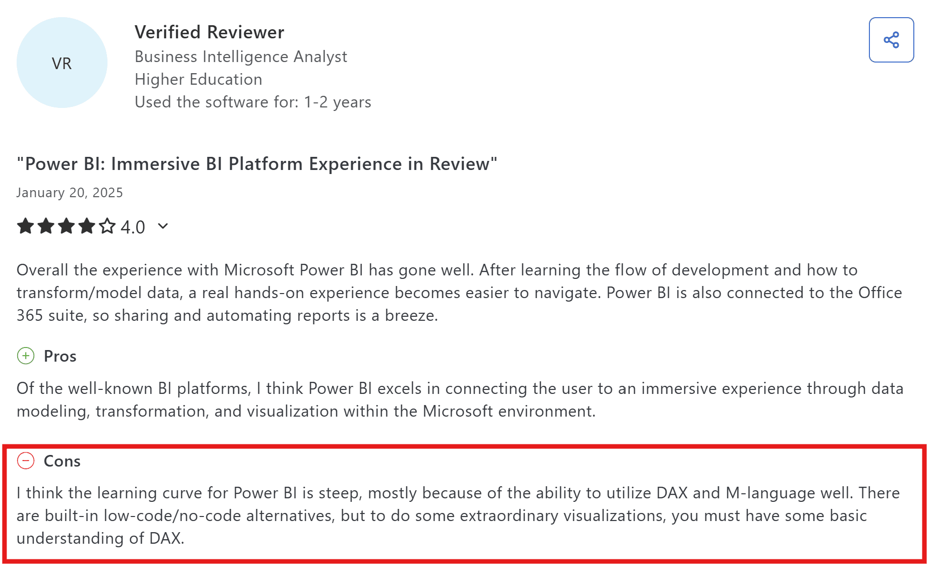
Source: Capterra
Dependence on dashboards: Everything still flows through manual dashboards and reports.
Slow performance with large datasets: As data grows, reports and dashboards can become slower to load or refresh, especially when pulling from multiple sources or cloud environments.
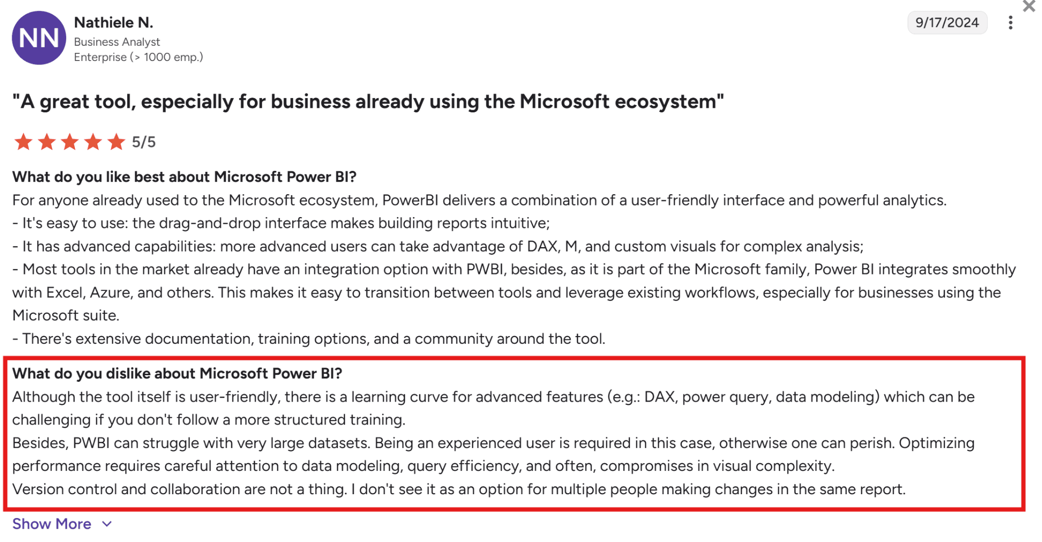
Source: G2
Limited automation for report generation: Power BI automates data refreshes, but you still have to manually update visuals and exports.
10 Power BI alternatives compared: features, pricing and fit
Here’s a quick look at how top Power BI alternatives stack up on AI, deployment and pricing:
Tool | Best For | AI and Automation | Deployment | Pricing | Why It Stands Out |
WisdomAI | Agentic intelligence across all your data | Context-aware agents that automate data analysis and deliver real-time insights | Cloud /On-Prem | Custom pricing | Every other tool here starts with a dashboard. WisdomAI starts with your question. Ask a question in plain language and get a trusted answer. |
Tableau | Visual storytelling | AI-assisted exploration | Cloud / On-Prem | Starts at $75 per creator/month | Still the best at creating visuals. But someone has to build and maintain every dashboard, which gets expensive fast. |
Qlik Sense | Data exploration | AI-assisted insights | Cloud / Hybrid | Starts at $200/month (10 users) | Lets you explore data without following pre-set paths. Great when you don't know exactly what question to ask yet. |
Yellowfin Analytics | Embedded analytics | Assisted insights | Cloud / On-Prem | Custom pricing | Tries to combine dashboards, alerts, and collaboration in one place. Useful if your team is tired of switching between tools. |
Metabase | Open-source BI for small teams | Light AI querying | Cloud / Self-hosted | Free plans available, but premium pricing starts from $100/month | Good for small teams with straightforward reporting needs. Runs out of room quickly if your data gets complex. |
Apache Superset | Developer-led analytics | Community AI plugins | Self-hosted | Free but other cost overheads like maintenance and staffing can creep up. | Full control but zero hand-holding. If you don't have engineers who want to maintain it, skip this one. |
SAP Analytics Cloud | Enterprise planning and forecasting | Predictive modeling | Cloud | Custom pricing | Makes sense if SAP is your data warehouse. If it's not, you're paying for complexity you won't use. |
Zoho Analytics | Small businesses and quick setup | Conversational AI support | Cloud / On-Prem | Starts at $60/month | Affordable and capable for its price. But starts to feel thin once your team outgrows simple reporting. |
Jedox | Financial planning and forecasting | AI-driven planning and prediction | Cloud / On-Prem | Custom pricing | Built for FP&A teams that want planning and forecasting without leaving an Excel-like environment. Not a general-purpose BI tool. |
We'll take a closer look at each tool below, and you can also find a complete BI tool comparison here.
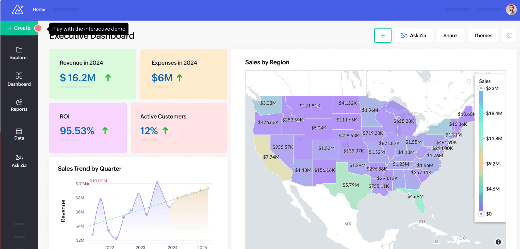
1. WisdomAI
WisdomAI takes a different approach to analytics. While traditional BI tools like Power BI rely on dashboards, manual data modeling, and DAX formulas, WisdomAI uses conversational, proactive agents that work across both structured and unstructured data.
You can simply ask a question in natural language, explore live metrics, and get automated reports and explanations to see what's happening in your data. It is faster to use, easier to adopt, and more practical for teams that need answers without extra reporting overhead.
Key features at a glance:
Natural language queries: Ask questions the way you'd ask a colleague. You don’t need to learn DAX or LookML.
Unified data access: Connects structured and unstructured data for a complete view of business performance.
Knowledge fabric: Understands your business context, so the answers you get are specific to how your organization actually works.
Proactive agents: Instead of checking dashboards for changes, AI agents monitor your metrics and flag anomalies, send alerts, and deliver summaries before you have to ask.
Automated analysis: Explains why metrics change and provides actionable recommendations to guide decisions. Also, the platform continuously learns from your feedback, getting smarter and more accurate with every use.
Pros
Anyone on your team can get answers without learning a query language.
Skips the dashboard insanity entirely: question in, answer out.
Handles structured and unstructured data together.
Provides proactive insights instead of reactive reports.
Cons
Advanced features may require onboarding support.
2. Tableau
Tableau is a data visualization platform that emphasizes visual analytics and storytelling. It's more flexible than Power BI in visual design. However, that flexibility comes with trade-offs: higher costs, less native Microsoft integration, and a workflow that still relies on someone to build and maintain dashboards.
Key Features
Drag-and-drop interface: Build charts, maps, and dashboards with minimal coding. Straightforward for basic use cases.
Wide data-source connectivity: Connects to cloud, on-prem, and hybrid sources without much fuss.
Tableau pulse: Offers AI-assisted exploration, automated insight summaries, and natural-language Q&A for metrics.
Advanced visual analytics: Rich chart and mapping library for detailed analysis.
Real-time data updates: Live data connections and interactive dashboards.
Pros
Intuitive for visual dashboards and data storytelling.
Large community, extensive training, and certification paths.
Handles large datasets while keeping visuals responsive.
Cons
Licensing costs scale fast as users grow.
Non-technical users still need time to get productive.
Performance can dip on very large or complex workloads.
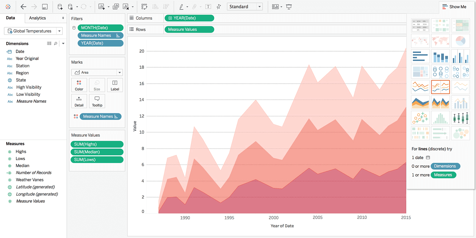
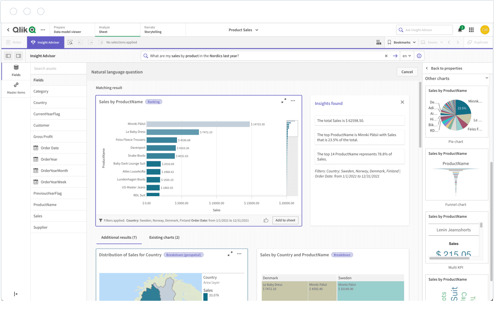
3. Qlik Sense
Qlik Sense is designed for data discovery. Its associative engine lets users follow any path through the data, rather than being constrained to pre-built queries and dashboards. The AI layer surfaces trends and predictions, and deployment runs in the cloud, on-prem, or in a hybrid environment. Find more Qlik alternatives here.
Key Features
Associative engine: Explore data freely without being locked into someone else's report structure.
Augmented analytics: Built-in AI delivers automated insights, natural-language queries, and predictive modeling.
Advanced analytics: Integrates AutoML to build models and run real-time calculations.
Embedded analytics: Offers full functionality across devices with the option to embed analytics directly into your team's workflows.
Pros
Easy dashboard creation with strong visualization tools.
AI-assisted analytics for faster, smarter insights.
Supports both cloud and on-premises deployments.
Cons
Performance may drop with very large datasets.
Limited export options and license constraints.
Data refreshes aren't always as fast as you'd like.
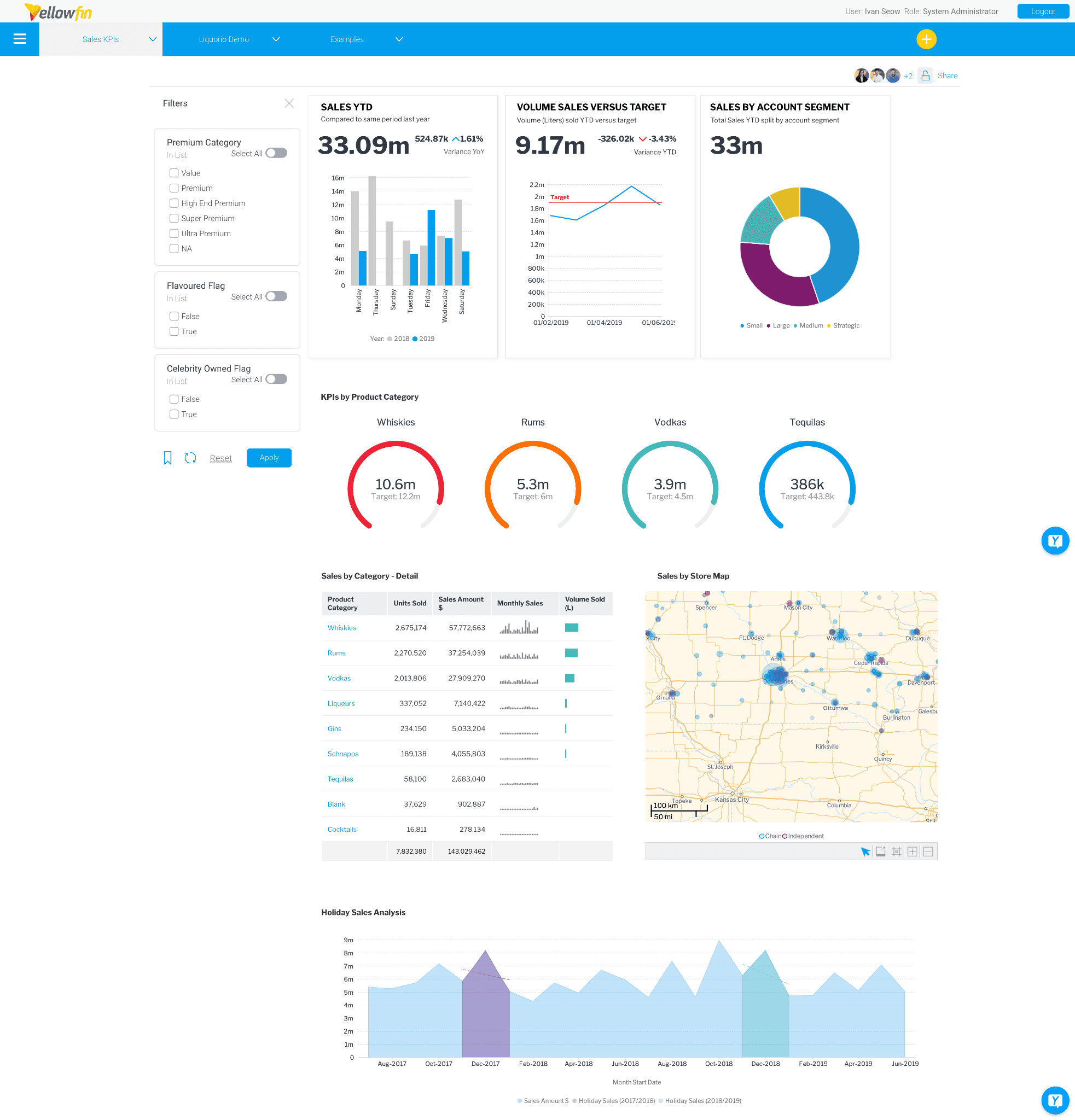
4. Yellowfin Analytics Platform
Yellowfin combines dashboards, alerts, reporting, and embedded analytics into a single workflow. Power BI can handle each of these separately, but it usually requires more tools and manual setup to connect insights to action. Yellowfin shortens that gap. It also supports white-label and embedded analytics if you need dashboards inside your own product.
Key Features
Embed dashboards: Embed workflows and dashboards directly into existing products.
Assisted insights: AI automates the detection of key changes in data.
Narrative storytelling: Create data stories and reports that explain what changed and why.
White-label analytics: APIs and developer tools to embed analytics in apps and customize user experience.
Pros
Data storytelling and sharing features.
Responsive customer support.
Flexible integration across data sources.
Cons
Advanced reports and complex setups take time to build.
Performance can lag on larger datasets, and bugs occasionally pop up.
Managing multiple reports and editing formulas feels more limited than you'd expect.
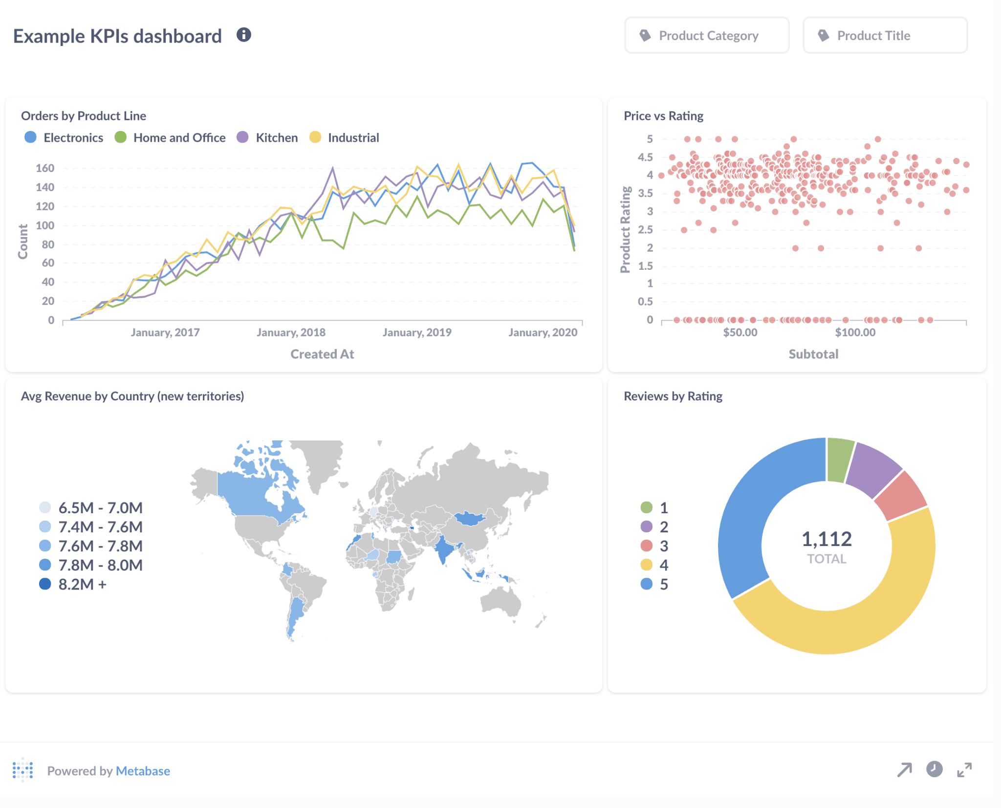
5. Metabase
Metabase is the lightweight option. Where Power BI requires some technical knowledge to set up reports and data models, Metabase gets you from database to dashboard with minimal setup.
The trade-off is depth. Metabase is ideal for small teams where someone needs to analyze data and not govern it. The platform will run out of room once your dashboards need to scale or your team starts caring about row-level security and audit trails.
Key Features
Metabot AI: Ask questions in plain language and get answers from connected databases.
Drill-through dashboards: Explore data without writing new queries.
Visual and SQL querying: No-code builder for business users and SQL editor for analysts.
Access control: Row and column-level security with role-based access and SSO integration.
Pros
Visual builder and SQL editor in one tool, for mixed-skill teams.
Flexible cloud or self-hosted deployment.
The open-source version is a legitimate starting point.
Cons
Performance issues creep up on large datasets.
Design and customization controls are limited.
Several higher-value features are available only behind paid tiers.
6. Apache Superset
Superset gives technical teams what Power BI doesn't: Full control over your stack. It's open-source, connects directly to modern SQL databases, and offers both a drag-and-drop builder and a full SQL editor.
The flip side is that Power BI gives you vendor support, a managed ecosystem, and easier onboarding. In Superset, you build your analytical stack, and you maintain it.
Key Features
Custom plugins: Extend visualizations through a plugin architecture.
Dual query modes: Provides both a no-code chart builder and a full SQL editor for advanced data users.
Modern data-stack integration: Works with Snowflake, BigQuery, Trino, Redshift, and others.
Semantic layer and virtual datasets: Reusable metric definitions across users.
Pros
Open-source and developer-friendly.
Strong SQL support and flexible querying tools.
Broad connectivity with modern and legacy databases.
Cons
Requires SQL fluency to get real value.
Weaker modeling layer compared to enterprise BI platforms.
Community-based support may lead to slower issue resolution.
7. SAP Analytics Cloud
SAP Analytics Cloud combines BI, predictive analytics, and financial planning on a single platform.
Unlike Power BI, it integrates AI-powered analysis with planning and scenario modeling. With Joule Copilot, you can automate reporting, surface insights, and ask questions about your data.
Key Features
Joule Copilot: Generative AI capabilities for discovering insights and data modeling.
Pre-built business content: Industry-specific dashboards, KPIs, and models.
Scenario simulation: Predictive simulations for best, worst, and likely outcomes.
Native SAP integration: Direct connectivity with SAP Datasphere and S/4HANA.
Pros
Strong visualization with an intuitive interface.
Predictive analytics and planning in one platform.
Well-suited to large organizations that are tied to the SAP ecosystem.
Cons
Complex setup and learning curve for new users.
Unstructured data handling is weak.
Limited customization and integration outside the SAP ecosystem.
8. Zoho Analytics
Compared to Power BI, Zoho Analytics simplifies data preparation, visualization, and sharing through automation and AI assistance. It's affordable and capable at the starter tier, but it starts to feel complex once teams need more than basic reporting.
Key Features
Ask the Zia agent: Natural-language questions return charts and reports instantly.
Data preparation: Connectivity with 500+ data sources.
Automated analysis: Historical, diagnostic, and predictive analysis with anomaly detection.
Customizable dashboards: Broad visualization library with drag-and-drop interactivity.
Pros
Easy to use with minimal technical skills needed.
Strong integrations across diverse data sources.
Real-time insights with AI-powered visualization.
Cons
Steep learning curve for advanced features.
Limited workspace customization.
Hits a ceiling on complex analysis and large-scale customization.
9. Jedox
Jedox is built specifically for financial planning and performance management, not general-purpose BI. If your data lives in Excel and your team wants to analyze that data without leaving the environment, it's worth a look. It combines analysis with integrated business planning, AI forecasting, and real-time simulation.
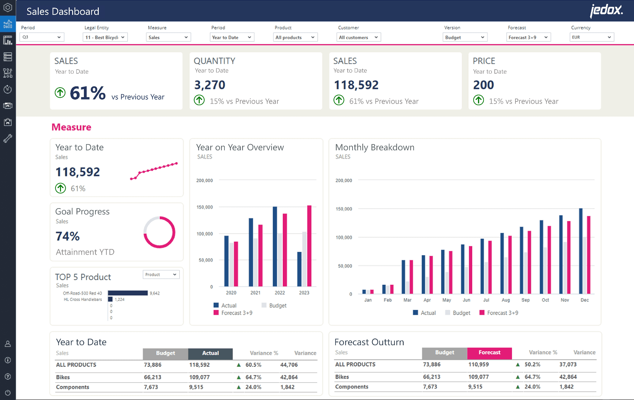
Key Features
JedoxAI Intelligence Engine: Explainable forecasts, real-time insights, and automated recommendations.
Integrated business planning: Financial, operational, and strategic plans in one environment.
Excel integration: Add-in for data entry, analysis, and reporting with familiar formulas.
Data modeling: Build models, simulate scenarios, and test assumptions in real time.
Pros
Familiar, Excel-native interface for finance teams.
Strong forecasting and planning workflows.
Flexible modeling and workflow customization.
Cons
Long implementation timelines.
Complex integrations may require IT involvement.
Usability challenges when managing large or detailed reports.
Diagnose the real problem before picking a new tool
The Power BI alternatives conversation always ends with the same names: Tableau, Zoho, and SAP. But before you default to the obvious, ask yourself why you're switching. Is it cost? Complexity? Or just dashboard envy?
Because that answer matters. If your team is still waiting on reports, pulling numbers by hand, and not getting answers fast enough, swapping one dashboard tool for another won't solve the problem.
That’s why WisdomAI stands out. Our conversational, proactive agents help teams go from questions to analysis faster, with less dependence on dashboards and manual reporting. It brings together structured and unstructured data so your teams can get reliable answers faster. And it infuses business context within every query or automation, ensuring accuracy that grows the more you use it, achieving +95% in most enterprise settings
Generate answers, not reports. Start a demo today.